A highly anticipated entry into Asia Pacific
With a minimum of six fitness centres opening across Australia and Asia (five have now been completed – one in Singapore, one in Melbourne's South Yarra as well as Sydney’s Kings Cross, Martin Place and Surry Hills – while one more is underway in Melbourne's Flinders Lane), the rollout of Barry’s is an immense and ongoing project.
One of the most critical aspects was maintaining continuity in the design language and branding of Barry's - taking that from the US to APAC, while also adding touches to each venue to communicate the individual locale.
To maintain branding consistency across multiple locations, Barry’s engaged Schiavello Construction in a design and construct (D&C) model. This involved taking on a project manager role of sorts – finding locations for the fitness studios, cost planning, researching Barry’s as a brand and being responsible in ensuring the same design language and brief was rolled out across each location, regardless of who the interior designer and contractors were.
We started by working on the high-level look and feel, then found local designers to complete the next phase of the design development. By us doing high-level first, it meant we could start pricing, working with acoustic and structural engineers and get the concept signed off with Barry’s in the US in the background while the designers were working, thus speeding up the process.
The D&C model meant we engaged and managed the contractors all the way to completing the construction work.
A place to belong
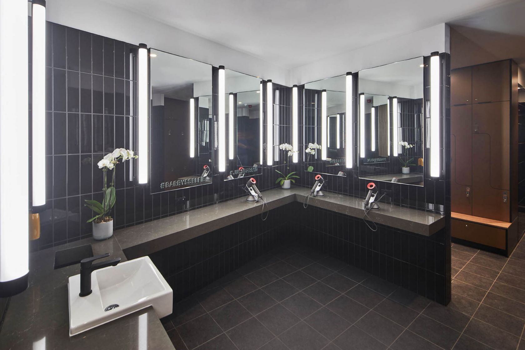
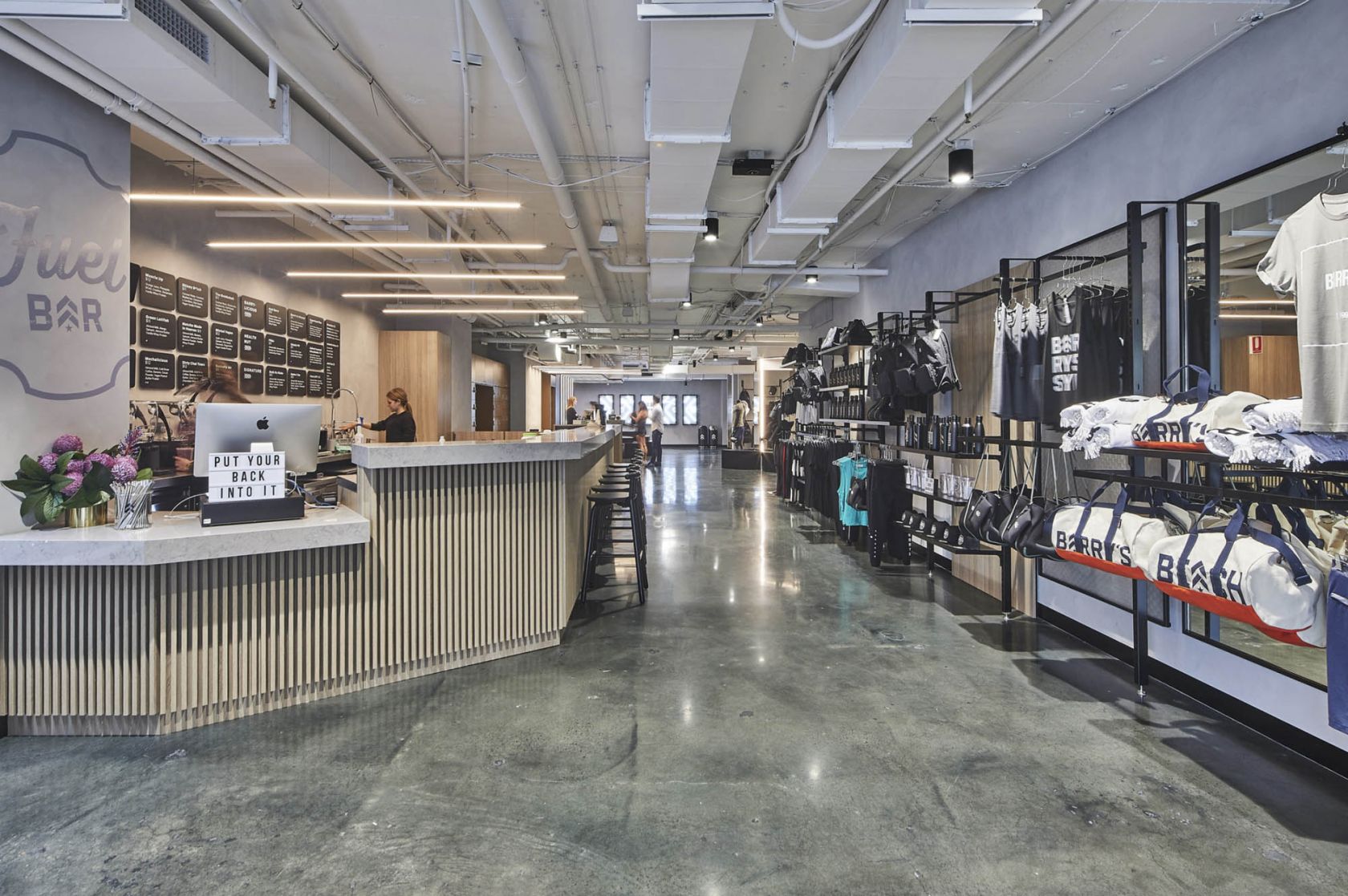
Consumers are now placing an ever-increasing value on their experiences with brands. Barry’s embraces this by offering the ‘best in class’ – an attitude that extends well beyond the luxe amenities, fuel bar and retail area. There is an atmosphere about Barry’s that delivers a sense of community, belonging and advocacy, and this was imperative to communicate in each location across the APAC rollout.
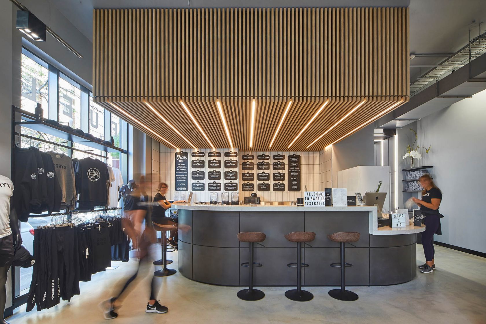
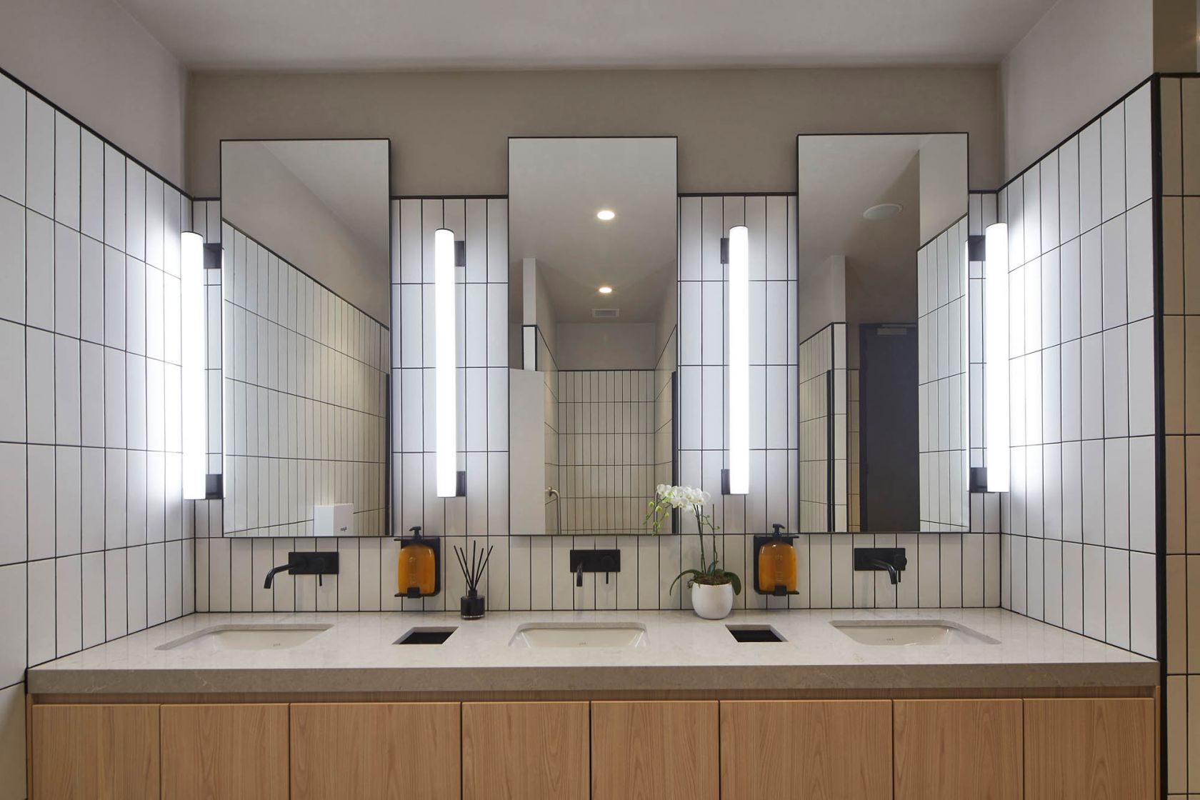
Part of this sense of belonging comes from the layout of the space, which is consistent across all sites globally, providing members with a level of comfort and ease from studio to studio; knowing that whichever Barry’s they go to, they know where the bathrooms, fuel bar or stretch areas will be.
One of the things that we liked about Barry’s is the fact that every one of them is instantly recognisable when you enter it, but they’re all also distinctive and individual. If you’re in the Barry’s on the Upper West Side, in New York, it’s refined, with dark, stained timbers and reappropriated fireplaces, whereas Venice Beach, which is a grungy suburb in Los Angeles, has graffiti on the walls and raw finish timbers.
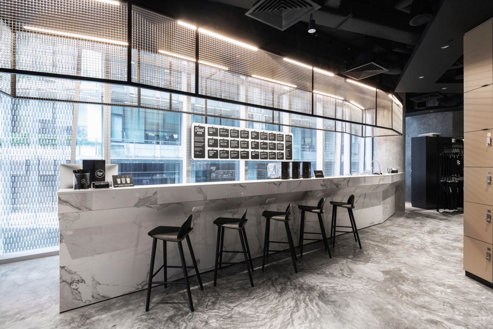
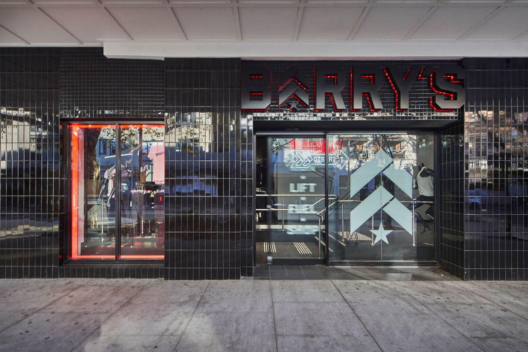
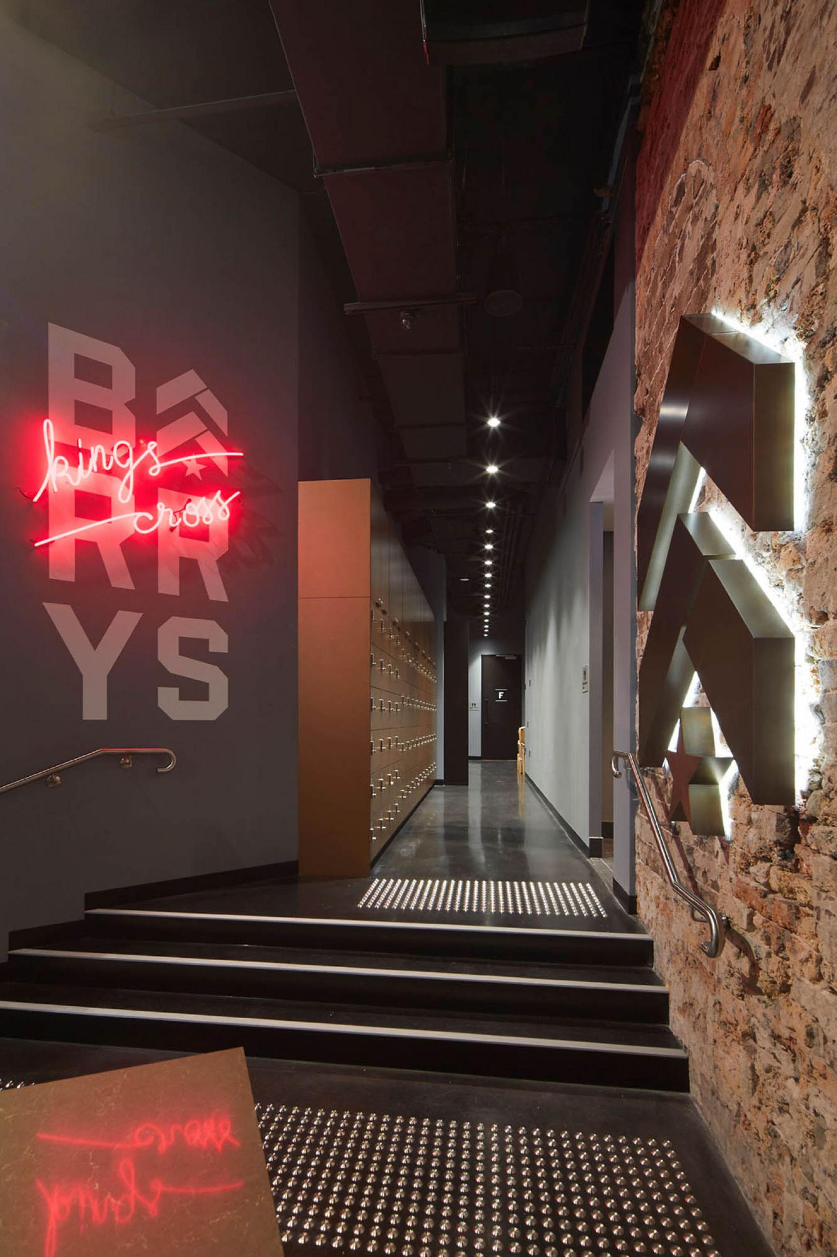
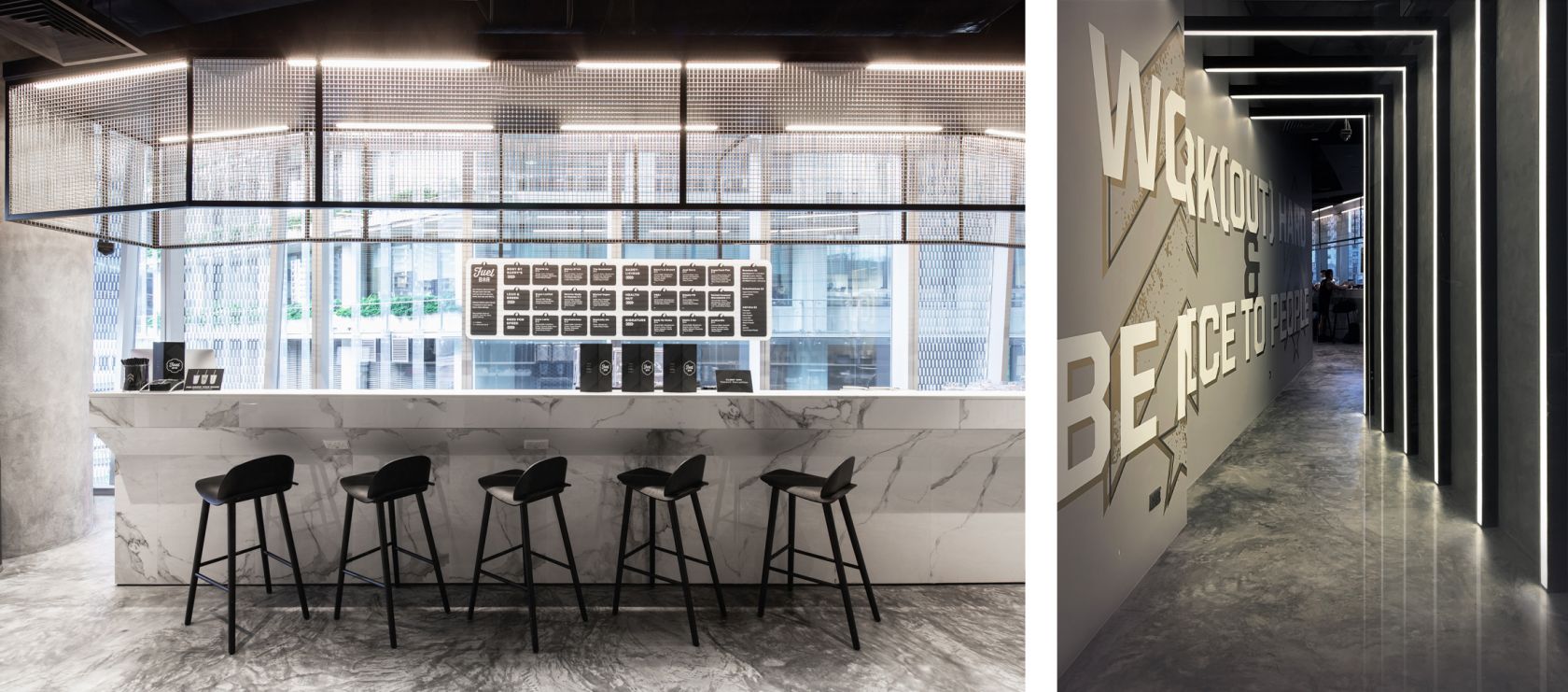
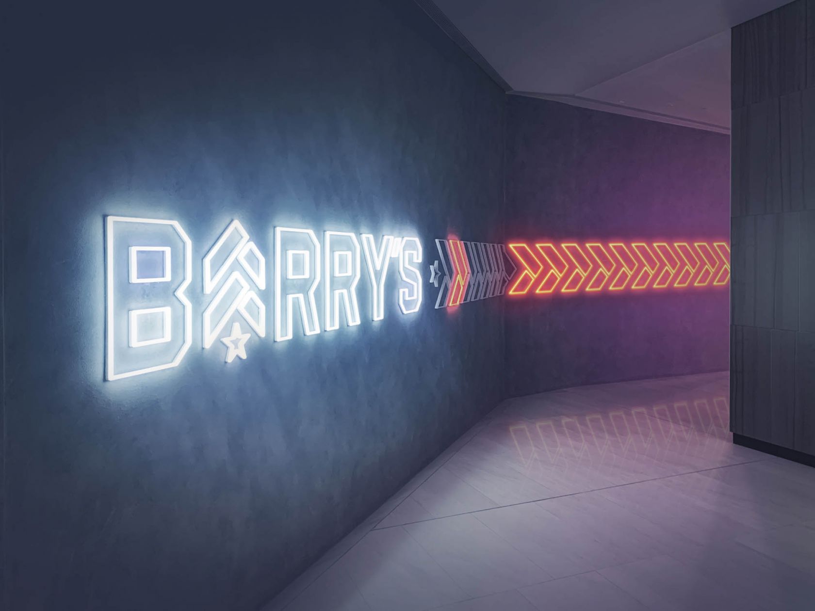
Similarly, each APAC location was designed with an individual local charm. Martin Place – an urban spot, right in the heart of the city - features a gold and a grey colour palette to reflect its concrete jungle surrounds. Meanwhile, black and white dominate Kings Cross, with neon motifs evoking the area’s history as Sydney’s red-light district, as well as gold chain links hanging over the top of the fuel bar and gold tiles on its front face.
One size doesn't fit all
Since entering the APAC region, Barry’s has taken up residence in some of the least traditional spaces – from basement carparks to a long-vacant heritage building. And each of these spaces posed their own special kinds of challenges.
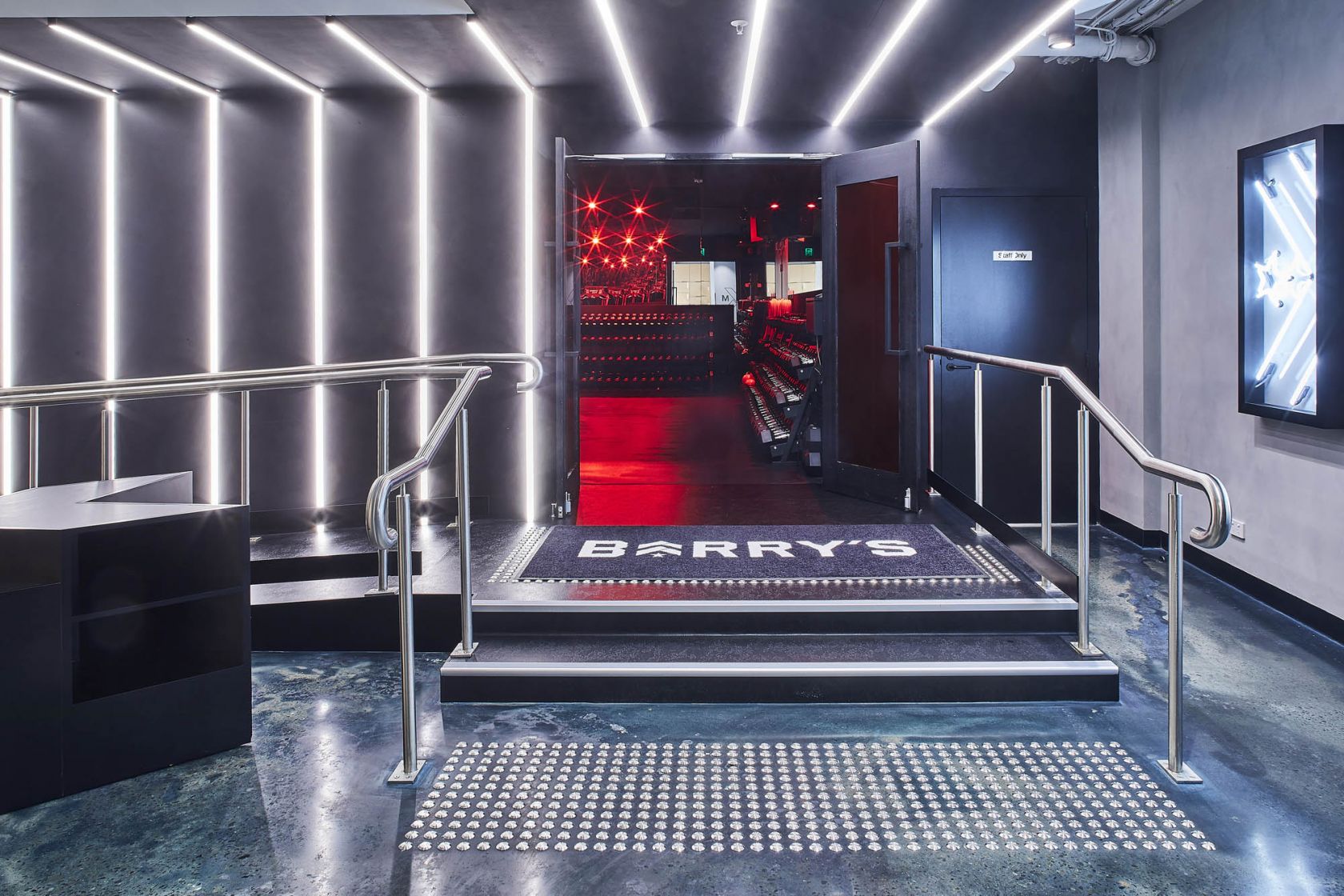
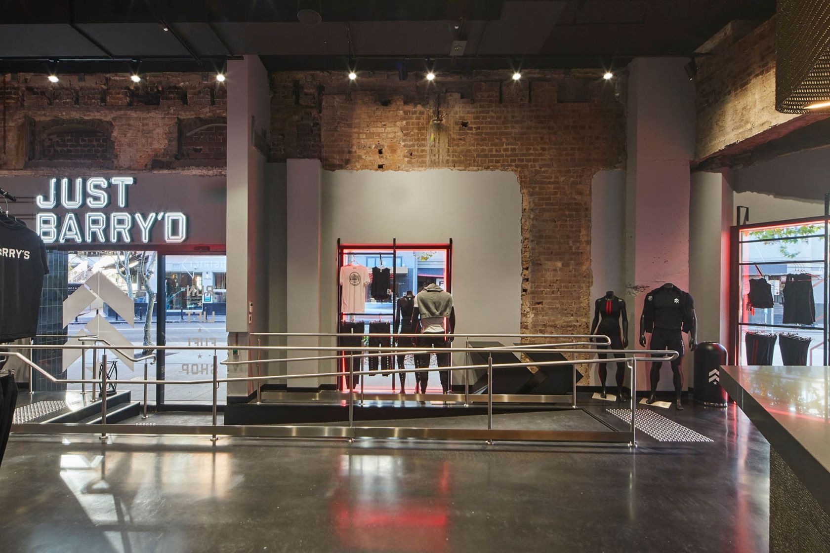
“In Martin Place, there was a step going up into the red room that we couldn’t avoid, but of course you have to allow for disabled access,” says Julia Liao of RFA Architects, the designers behind the Martin Place and Kings Cross locations. “So we installed a ramp, but then how do you make that an architectural feature? We built a light tunnel to make people entering the room feel like a superstar, heading into the workout experience. The lighting and the feeling that takes over you while walking through the tunnel makes you not even notice you’re going up a ramp.
“And Kings Cross was a heritage building, a historic pub, so we had to retain the external façade. So rather than touching the outside, we decided to take the outside character and draw that inside.” Exposing the internal brickwork and mirroring tile work from the façade throughout the interior allows the bones of the building to speak for themselves and retain a sense of historical place.
Creating the red room
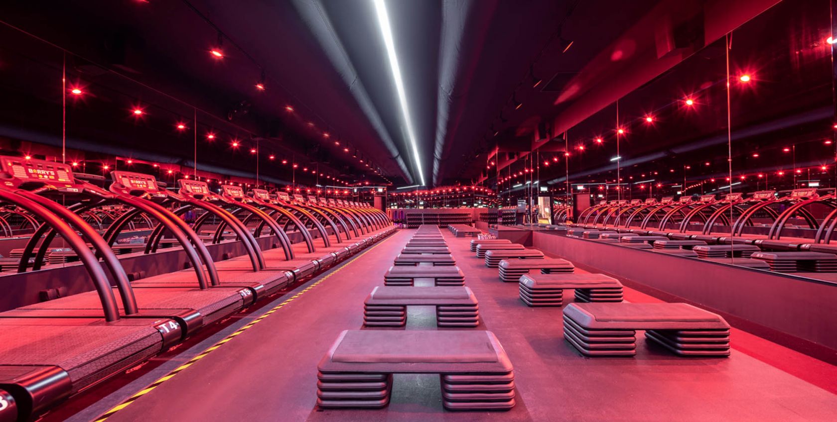
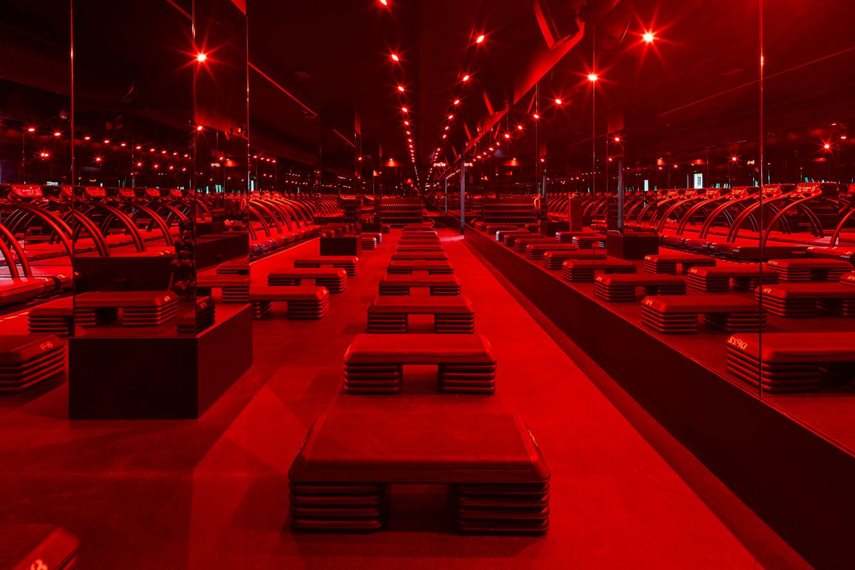
The biggest challenge of the Barry’s rollout, however, was without a doubt the red room. Due to the high-intensity activity and nightclub volume music that happen within it, the space had to be insulated to an essentially soundproof level and with adequate ventilation to keep a group of sweating bodies cool.
Barry’s learned a lot of lessons in the US regarding acoustics. So we were lucky because we could take those lessons and make an even better version here right off the bat. We went straight for the Rolls-Royce of soundproofing and sandwiched Embelton springs between floating concrete slabs to take the reverberation out of the sound. Particularly with residential apartments above the Kings Cross studio, and Channel 7 sound stages adjacent to Martin Place, ensuring no sound was leaking was absolutely paramount.
Consistent in the brand’s iconic red room and critical to the client were the red-hued lights that don the space. To ensure those in APAC were the same red as the ones in the US, RFA Architects, Eduardo Donatti and DEVO (who brought the Surry Hills and Singapore studios to life respectively) imported lighting from the same overseas manufacturer as the US locations.
Designing not just a fitness studio, but an experience
More than just weight racks and gym floor mats, the Barry’s rollout was about taking a successful and established international brand and translating it, ever so slightly, to accommodate local APAC destinations. From Surry Hills – the first Australian Barry’s – through to Singapore, and the under-construction Melbourne studio, each location has a distinct Barry’s aesthetic, imbued with a local flair.
Every Barry's location makes you feel good about yourself and like you are part of the Barry's family.
Julia adds, “The fitout creates an atmosphere that motivates you to keep moving. And every single corner of each location is Instagrammable. You want to be there. I don’t feel like we designed a gym; I feel like we designed an experience. We are proud of what we have done to make Barry’s vision come true.”
Utilising Schiavello’s D&C process maintained a smooth, streamlined and fast-tracked process (each location was completed within 12 weeks), not just for the client, but for everyone involved. “RFA and Schiavello worked closely together, and Schiavello played the important role of a bridge between us and the client. When talking to us, Schiavello was in the client’s shoes, and when talking to Barry’s, they were in our shoes, which made everything run so smoothly. The process was really good. Working with an in-house design manager halved the time for me and my team,” she says.
“There was daily collaboration between us. Barry’s has its ‘fit fam’, but in the end, we were a construction family.”
Step inside
Acknowledgement: Julia Liao would like to acknowledge the exceptional work of her team on the Martin Place and Kings Cross projects - Lily Ng and Lachlan Smith.

