-
Location
525 Collins Street
-
Completed
May 2017
-
Architect
Geyer
-
Area
4,000sqm
-
Type
Fitout
-
Delivery Type
Fixed Lump Sum
-
Duration
7 months
-
Project Manager
Montlaur Project Services
-
Value
$10M - $20M
-
Rating
Green Star
A bespoke fitout built to the bank's needs
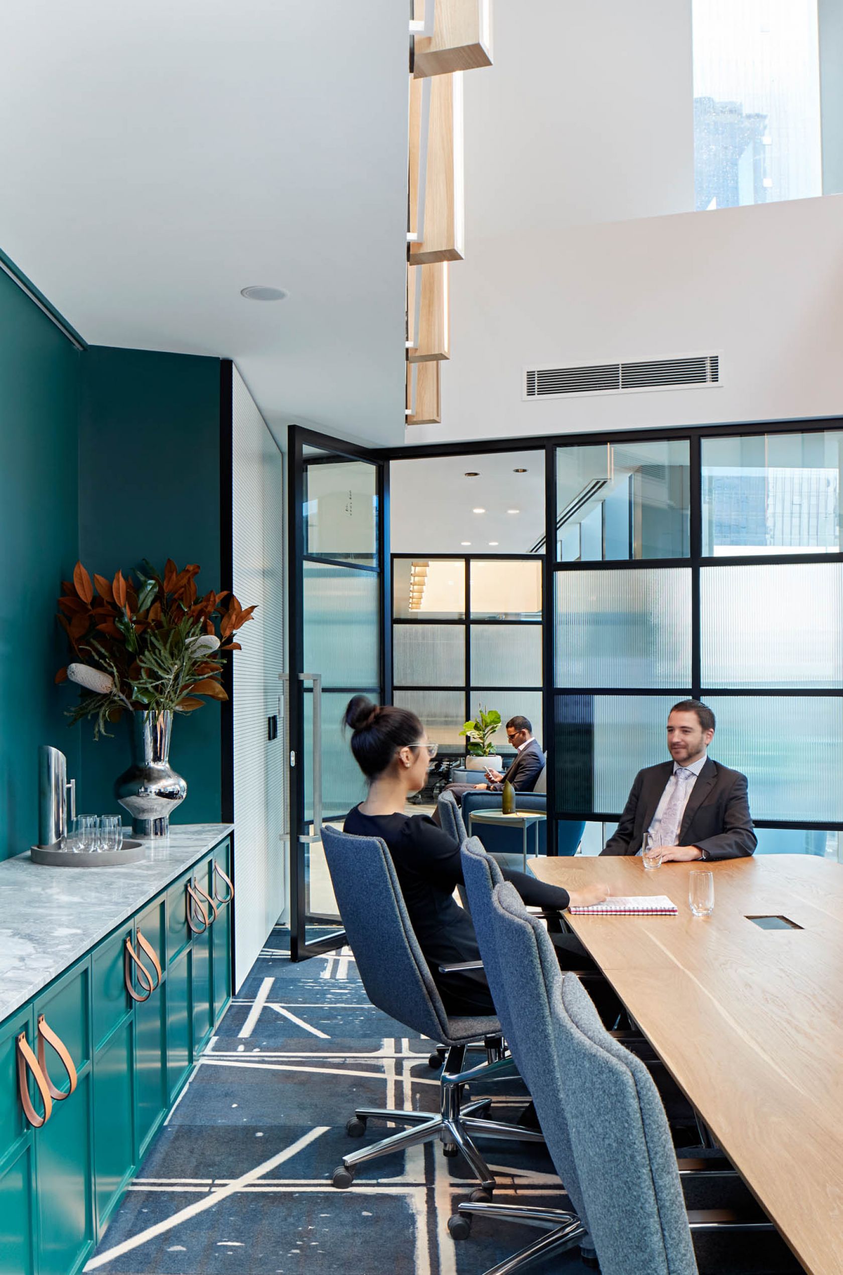
Schiavello, together with Montlaur Project Services, architect Geyer and Westpac’s property team, has delivered a people-centric workplace for the Bank of Melbourne headquarters. Spread across two floors and five distinct floor plates in Melbourne’s iconic Rialto Tower, the 4,000sqm space supports Bank of Melbourne’s positioning as Victoria’s local bank. The built space facilitates deeper engagement with staff, clients, and the community by maximising light and encouraging movement.
Bank of Melbourne’s focus on fostering a unique brand culture guided this project. Grounded on in-depth research including site visits, time utilisation studies, and cultural examinations Montlaur Project Services, Westpac, and Geyer engaged Schiavello to create a physical space in line with Bank of Melbourne’s cultural, functional, and brand requirements. The resulting space, with its distinct choice of materials, has a particular Melbourne feel; a reference to the bank’s unique relationship to the city.
A range of agile workspaces and environments
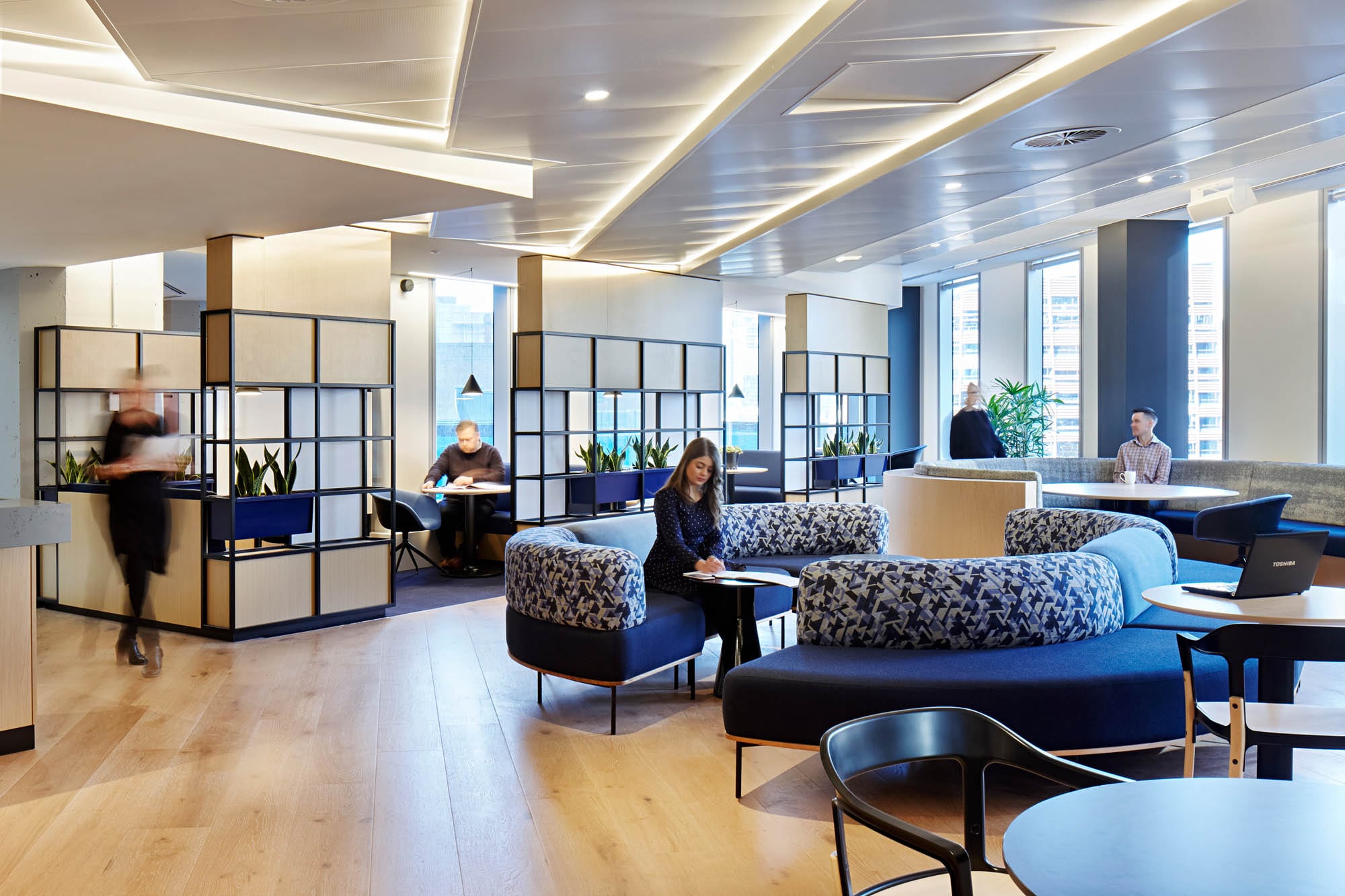
Aligning with the Westpac Group property guidelines, the spatial design solution provides for open, collaborative, and agile methods of working. Underpinned by a strong focus on movability and the transference of ideas across staff, the fitout features a mix of focus and collaborative spaces to cater to staff needs.
Technology is embedded throughout as an integral part of the experience. Home bases anchor four office neighbourhoods, each featuring interactive screens and impromptu meeting facilities. Meeting rooms feature teleconferencing and video conferencing capabilities.
“Our new agile workspaces and environment have helped Bank of Melbourne’s unique culture to develop and flourish through increased team collaboration, state-of-the-art client spaces and forward-thinking technology,” says Michelle Winzer, Bank of Melbourne Chief Executive.
An extensive change management process was undertaken by Westpac to fully prepare staff for the adjustment. This process ensured Bank of Melbourne employees were informed, comfortable and eager to embrace their new workspace.
A unique experience for clients and staff
The new office offers a unique experience for both clients and staff with spaces tailored to the bank’s unique needs.
The brand’s focus on the client experience is clearly translated into this commercial fitout with a dedicated space for high-end clients. The Shopfront – a permeable showroom flanked by perforated operable walls –greets clients and facilitates the bank’s physical and digital storytelling. The client space foyer is punctuated with contemporary furnishings in neutral shades of taupe and terracotta; while functional and beautiful, they don’t distract from the feature ceiling above. Timber beams with integrated lighting accentuate the height of the space.
The Factory is a place for innovation and collaboration. An enormous digital whiteboard allows for an effortless exchange of ideas whether users are onsite or offsite. The Startup Space is a dedicated training area for the growing team. Bank of Melbourne’s new workplace is interconnected yet easy to navigate, communal yet intimate with a sense of connectedness between different people and departments who would otherwise not cross paths.
Bridging the old and new parts of the base building
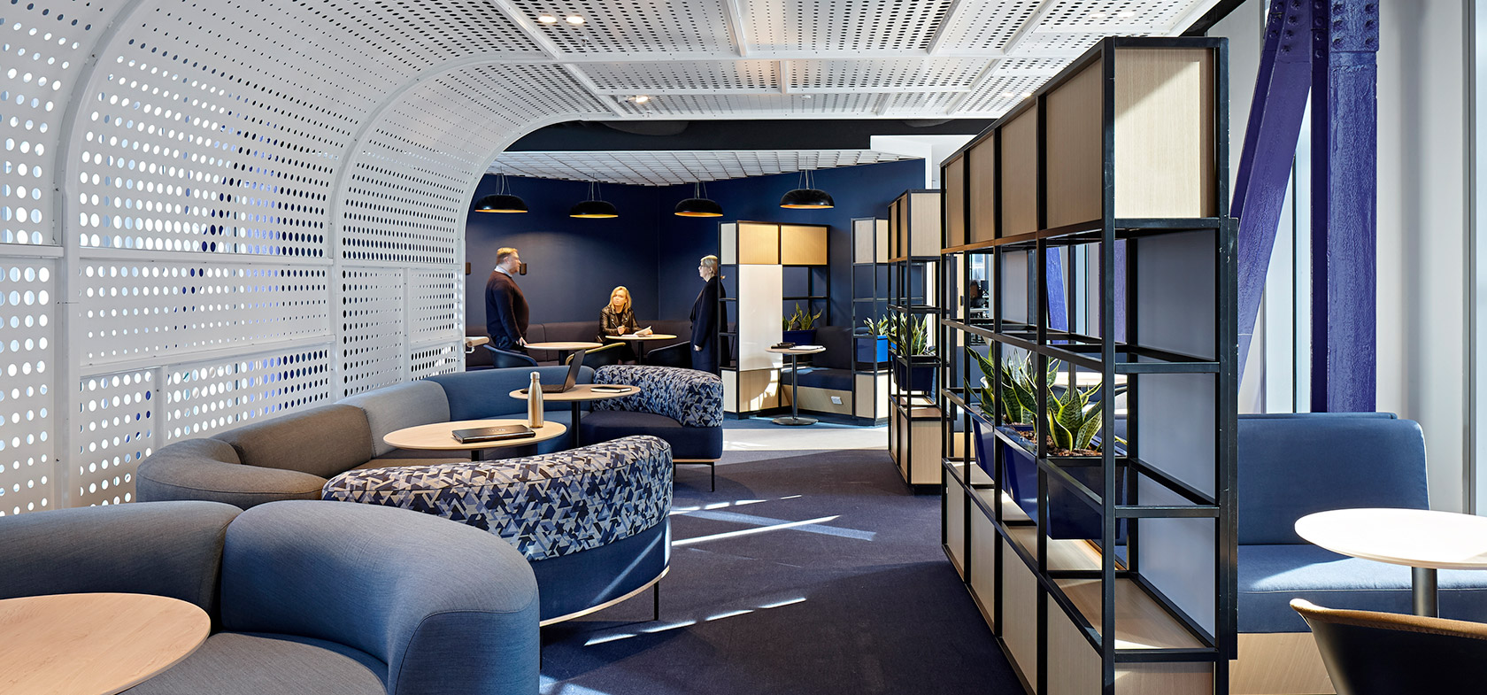
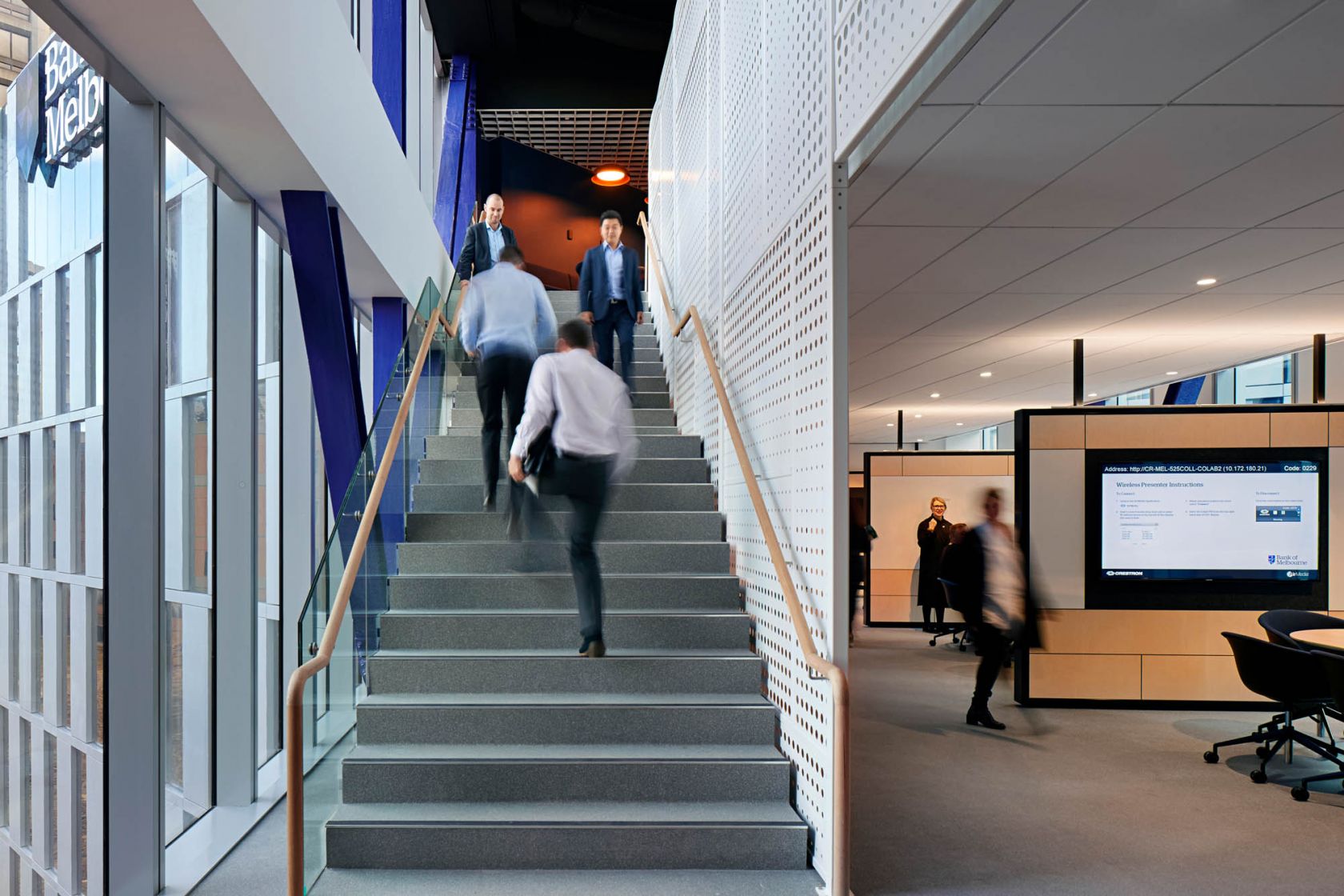
Spaces flow horizontally across each floor and interconnect vertically through the inter-tenancy staircase. The stair is strategically positioned on the two-level bridge, connecting the old and the new buildings. Vertically aligned with the stairs, a perforated metal veil rises from the ground on the lower floor and curves along the ceiling above, folding to house a cozy focus space. The six-meter bespoke curved screen admits an abundance of natural light and features integrated lighting for added ambience.
The openness is further emphasised by the feature stepped ceiling with recessed lighting – giving the illusion of natural light from above. These construction elements address the limitations of natural light usually felt by lower floor tenancies.
Constructed in conjunction with the base builder, Rialto’s history is integrated into the final design. A refined contemporary aesthetic bridges the old and new parts of the building. The intervention of original aspects of Rialto, including raw concrete columns; simplified core; and ceiling treatments, in an otherwise polished and modern workplace in respectful reference to the building’s three-decade history. Internal support trusses are exposed and presented in Bank of Melbourne’s brand colour purple.
Results of an open dialogue and collaboration
As a builder, it’s easy to be viewed as simply construction, but it’s much more than that. The wider team’s experience, expertise, and commitment to problem-solving brought the design to life efficiently and accurately.
Innovation and expertise from all parties involved resulted in a greater diversity of spaces. The new Bank of Melbourne premises succeeds due to the continual process of open dialogue and collaboration between Schiavello, Montlaur Project Services, Geyer, and Westpac.
Related Projects
Cisco
