-
Location
20 Elizabeth Street, Sydney
-
Completed
November 2018
-
Architect
Schiavello (Design Manager) + RFA Architects
-
Area
900sqm
-
Type
Fitout
-
Delivery Type
Early Contractor Engagement
-
Duration
12 weeks
Delivering Barry’s largest studio yet
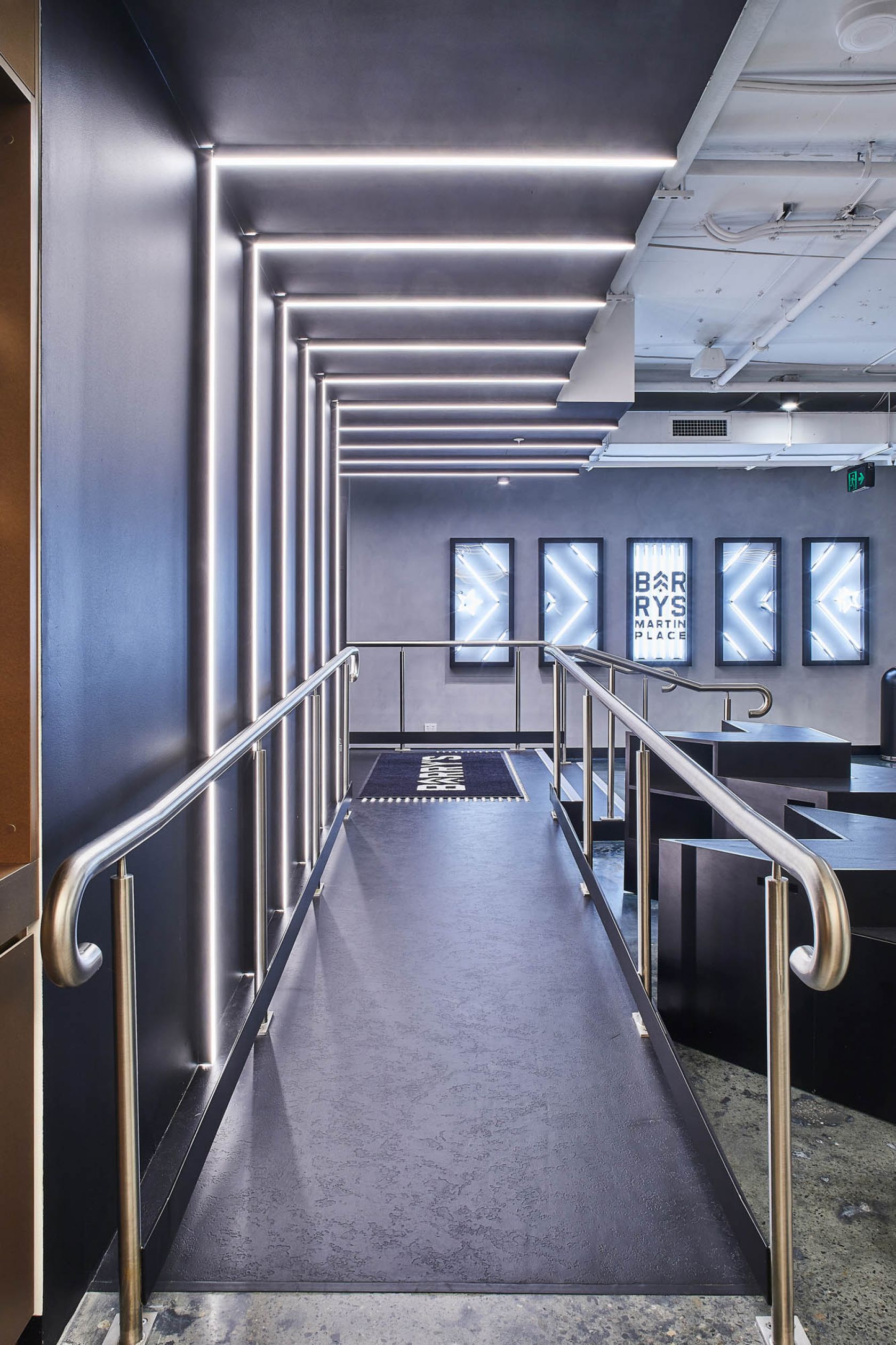
Nestled within Sydney’s financial heartland, the doors have opened to Barry’s largest studio yet. The iconic red neon signage casts a welcome glow against the bustling Martin Place thoroughfare, invigorating the otherwise monochromatic metropolis.
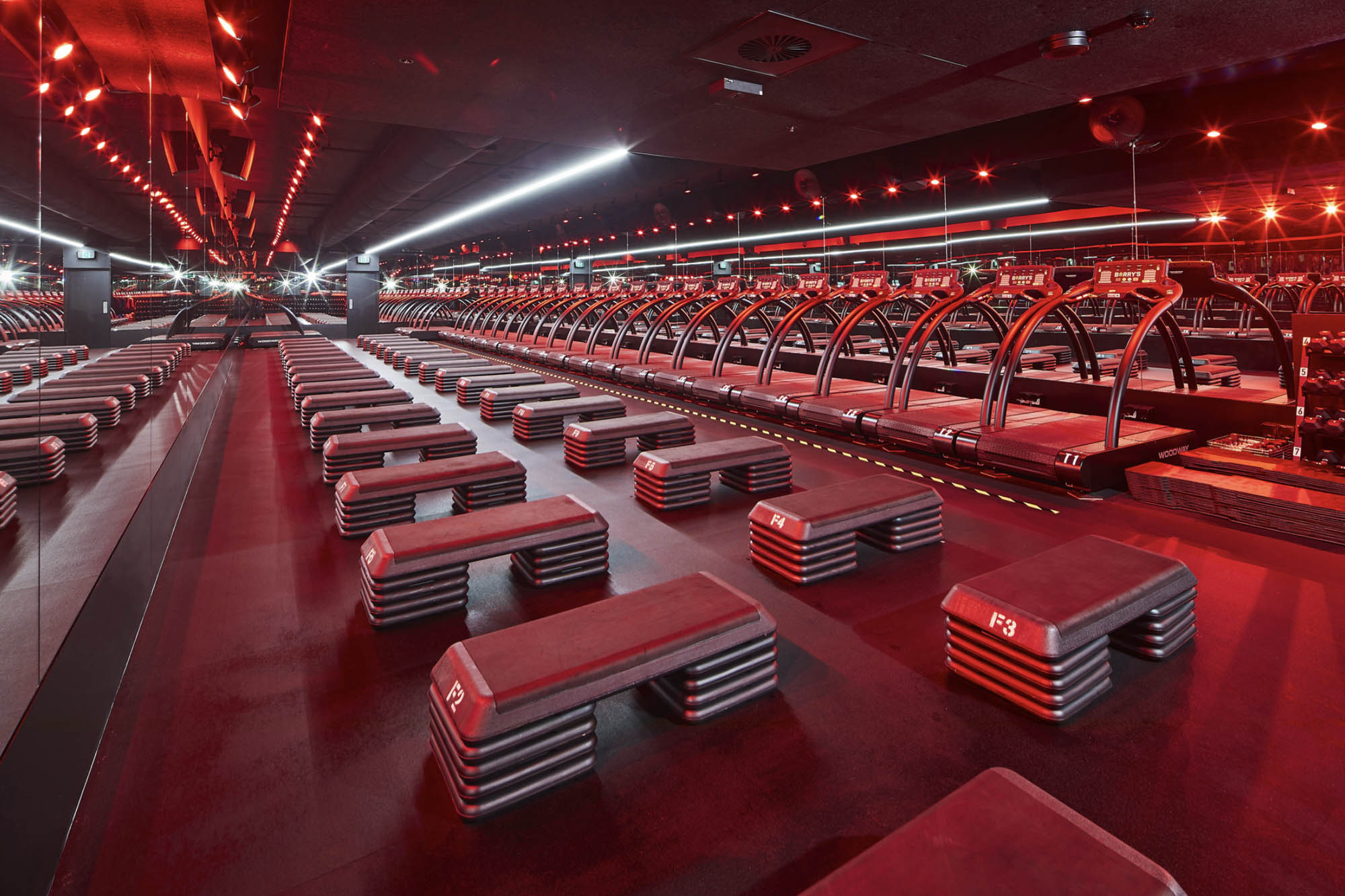
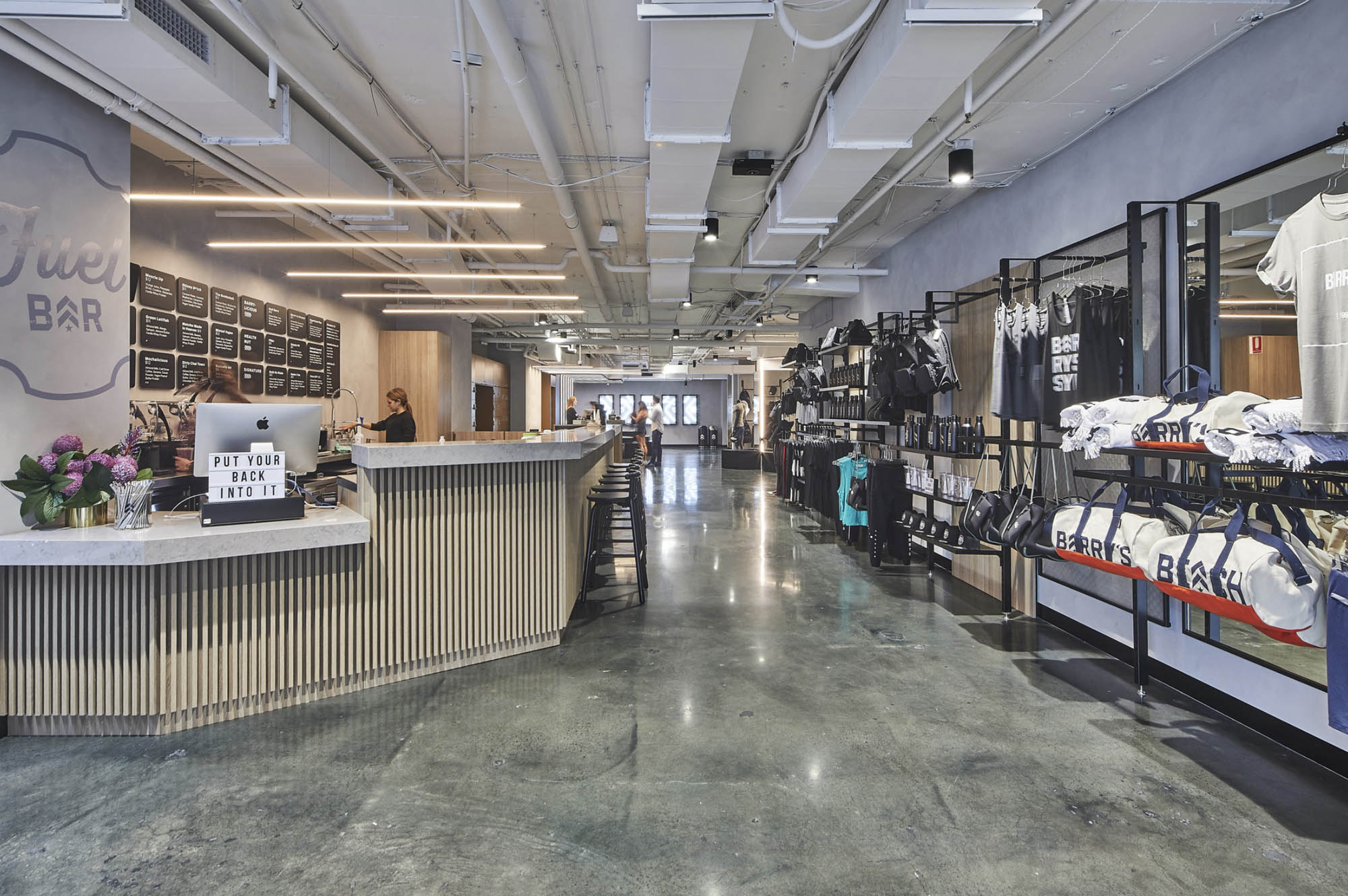
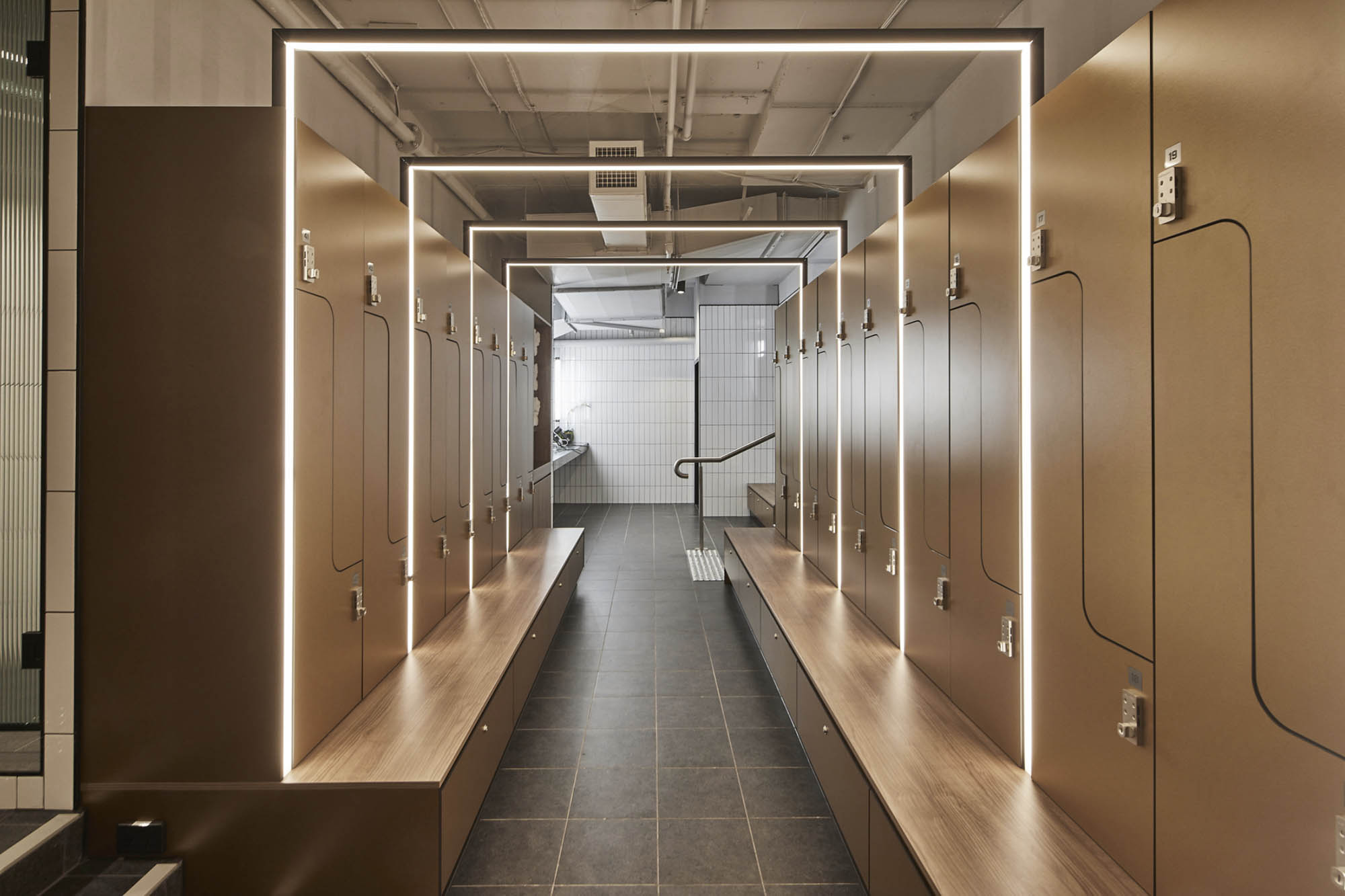
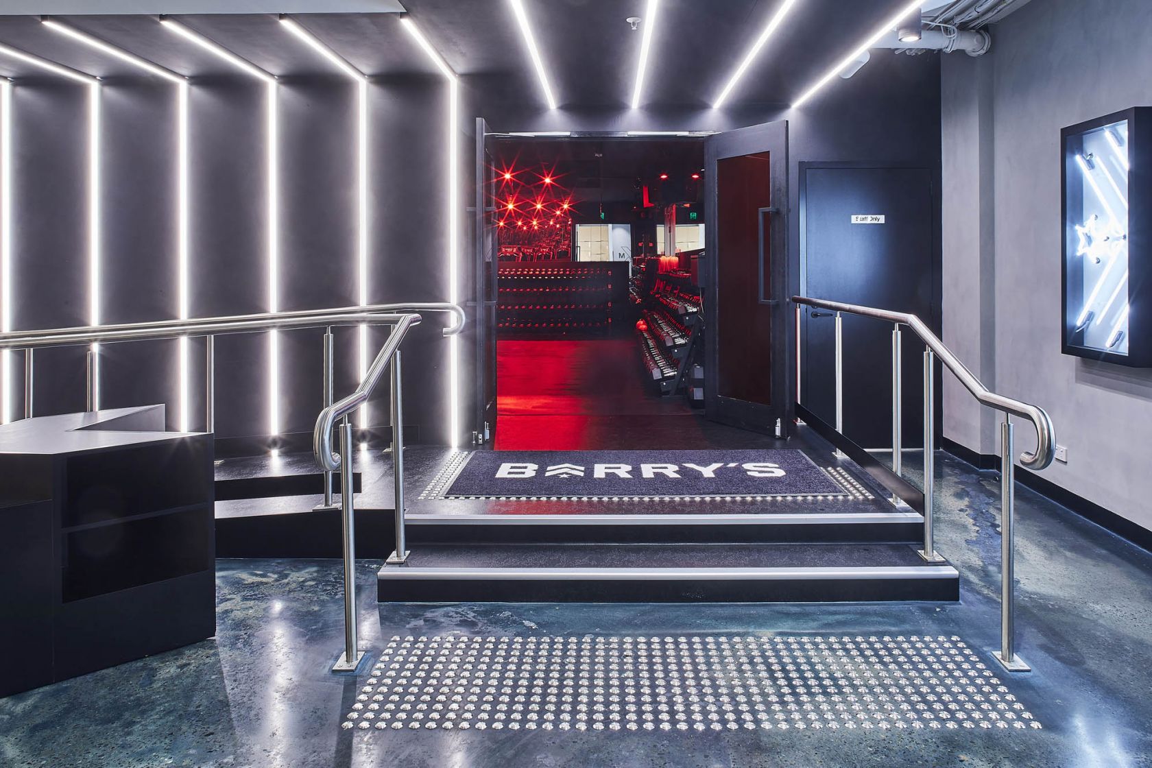
Continuing their national partnership with Schiavello Construction, fitness and lifestyle group Barry’s Bootcamp has seen its hero studio come to life. The space features an integrated stretch area, fully equipped change rooms, retail area, fuel bar, and the brand’s infamous Red Room.
Streamlined delivery
Following the successful delivery of Barry’s Surry Hills, our continued partnership allowed for critical construction knowledge and lessons learned to be carried forward. The result was a streamlined delivery for Martin Place, enabling Barry’s to generate revenue sooner than expected.
In particular, our knowledge allowed for a condensed development and the production of architectural focal points: joinery, steel tops for the fuel bar and signage, as well as the construction mechanisms used to achieve the Red Room effects.
As part of our learnings, we could also begin to anticipate potential challenges and develop solutions without impacting the programme. This can be seen most prominently in the mechanical works, where the existing system would not have supported the Red Room’s extensive airflow requirements. Being able to anticipate this meant that we could upgrade the base build prior to main construction works, avoiding issues that can commonly occur during operation.
Consistent design
Partnering with local design firm RFA Architects, Schiavello transformed the Barry’s US brand into a design that met local standards; creating an Australian design icon. Our continued partnership ensured consistency in the colour palette, materials, acoustics, and essential design elements. As an iconic international brand, this design continuity was critical. For Barry’s, this not only maintains their high spec finish, but it allows their customers to comfortably walk into any studio and know exactly where the fuel bar, amenities, and Red Room may be located.
Marketing for maximum impact
Aimed at driving further brand awareness and potential revenue for the client, we sought to maximise Barry’s exposure through customised hoarding along the busy Martin Place thoroughfare. Our graphic design team worked with signage contractors, the local council, and Barry’s international team to create a dynamic design which would also compliment the streetscape.
Being located on a busy thoroughfare and live footpath also meant that cleanliness was paramount. Employing sticky mats and cleaners each day, while keeping trades aware of their impact, meant that our site was always presentable and Barry’s was well represented for passers-by and potential future clients.
This was similar for noise pollution, particularly with Channel 7’s news studio located next door. Our team kept strict timeframes and out-of-hours work so that noise and vibration were non-existent during the day.
Related Projects
Barry's Bootcamp - Surry Hills
