I have so much to tell you. I am sat at a table strewn with charts and cards and fan decks. There is this odd prescience that what I have to tell you is so very important. Yet I do not know how to begin. My only recourse, then, is to recount the journey my mind traced. So, you will have to indulge me.
You are sat at this table, pawing through colour wheels and card samples. But, for some reason, you begin to picture a young English nobleman toward the latter end of the seventeenth century. You see his gown dripping in ermine pelts while spaniels jump and fidget between his stockinged legs as he reclines under an oak. You can see the fertile land of the English countryside stretching toward the horizon. He glances into the middle distance. He’s thinking back to Queen Elizabeth I’s funeral procession: the golden barge illuminated by Catherine wheels, the frigates of her ambassadors and their vermillion flags, all her courtiers in cochineal brocade and jet velvets flanking the Thames. And at this point amid this swell of gold, red and black, you see his eyes close – “Annihilating all that’s made / To a greene thought in a greene shade.”
The relevance of this – Andrew Marvell’s 1681 poem The Garden – appears, until proven otherwise, to be somewhat stretched. But look again. “A greene thought.” Contained in that one single world is the entire history of a nation. It’s a triumph of language – all of that distilled and wrapped up into one solitary word. But at the same time, Marvell’s greene thought represents the absolute limit of the English language itself. And at this point of language’s limit, the world of art
and design enters.
At once meaning (abstractly) so much and meaning (literally) nothing at all, Marvell’s greene thought flew to my mind a few weeks ago as I sat at that table with the colour charts. Across from me, Giulio Ridolfo explained his decidedly idiosyncratic approach to colour. “It’s like the alphabet,” he tells me. “Colours are like vowels and consonants, creating a language in the same way that colour composition and layering creates the vision of harmony in a space.”
“Like the alphabet,” he reiterates. And he’s certainly not wrong. Coded with meaning – potentially diverse and conflicting meanings – colour is paralinguistic, pulling the power of its sense-making from the endless encyclopaedias of cultural history. Not dissimilar to Marvell’s ‘greene’ signifying the hopes and fears of an entire nation, Ridolfo understands colour to be the most nuanced and complex system of intelligence to express the human condition. “For me, a palette is more than a selection of different colours,” he says. “They should generate possibilities – just like matching ingredients from a recipe to a more complex scene.” For Ridolfo, colour is the springboard of imagination. It’s the bedrock of innovation.
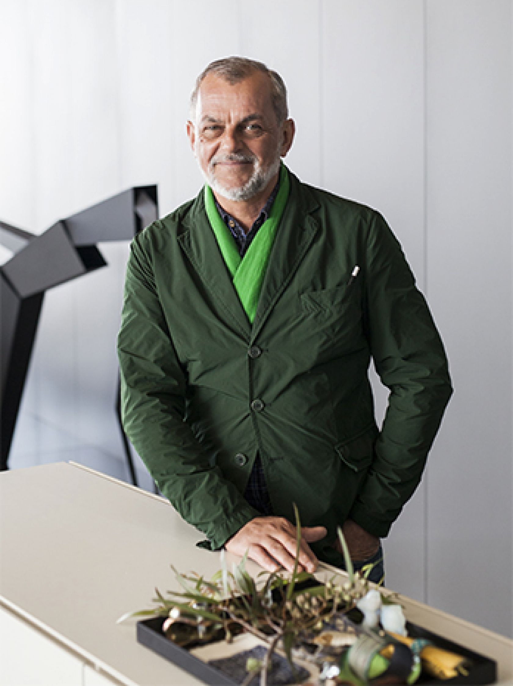
Holding this highly calibrated understanding of colour’s inherent intellect, it is little wonder that Ridolfo’s name has become synonymous with the term ‘maestro di colore’. Having crafted a career for himself as one of the world’s most sought-after colourists, in recent years Ridolfo has worked with major global brands including the likes of Tod’s, Vitra, Kvadrat and studio Heinle, among others.
During our conversation, I discover that I am in the presence of a renaissance man. Since graduating with a Masters in Fashion Design from Milan’s Domus Academy in 1985, Ridolfo has been tireless – collaborating on all manner of projects in countless studios from those of Fritz Hansen to Maharam.
His eye is something of a weathervane – in fact, his is possibly the most trusted eye in contemporary design (such would explain his indefatigable workload). But his carefully constructed palettes are not the result of having a keen eye for developing trends. Rather, it’s the quality of having an eye for the needs of end-users that truly sets his work apart.
Obviously it is this intensely human-centric philosophy that prompted Ridolfo’s most recent collaboration. In partnership with Schiavello, Ridolfo has launched a new palette for contemporary spaces inspired at every point by the very human connection to colour.
Celebrating over 50 years of marrying Italian design sensibility with Australian manufacturing, Schiavello sought to translate its zeal and poetic approach to design into a new range of colours. Ridolfo was the perfect man for the job, and the result – ColourLab – is undoubtedly a visual symphony. Wherever (or indeed, however) the eye alights across ColourLab’s comprehensive spread, each individual colour represents innumerable hours of research and development into human physiognomy, psychology and the colour’s compatibility with a range of fabrics, leathers and surfaces including plastic, veneers, timber, laminates, stone and metal alike.
ColourLab is not only a harmonious selection of colours but also a reimagining of colour itself as Ridolfo’s “alphabet, vowels and consonants”, smoothing the visual chaos of today’s world while celebrating its defining complexities. The tension resulting from this alternate smoothing and celebrating underpins ColourLab, which deftly balances contrasting and complementary colours. One ColourLab colour has many identities that are expressed according to the surface material with which it is paired: one colour can be bold and eye-catching on plastic or metal but soft and demure as a wash on timber.
And this is to be expected, I suppose. After all, the colour green (for instance) has been long recognised by colour psychologists to carry associations of tranquility, calmness and reflection, promoting physiological responses in the viewer to slow heart rates and aid mental clarity. Pantone declared 2016 to be the year of ‘greenery’, and that too is to be expected. Becoming voguish in the age of mass social upheaval, it’s hardly surprising that we increasingly crave respite from the helter-skelter through the neuroaesthetic reassurance of green.
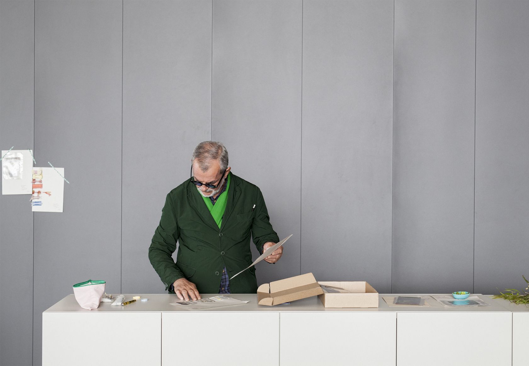
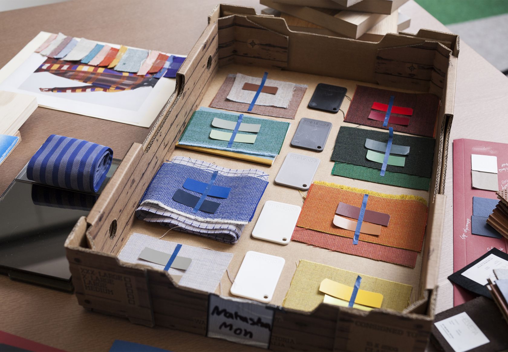
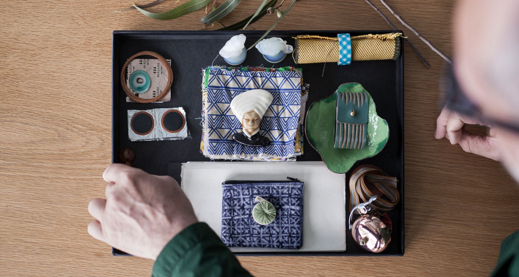
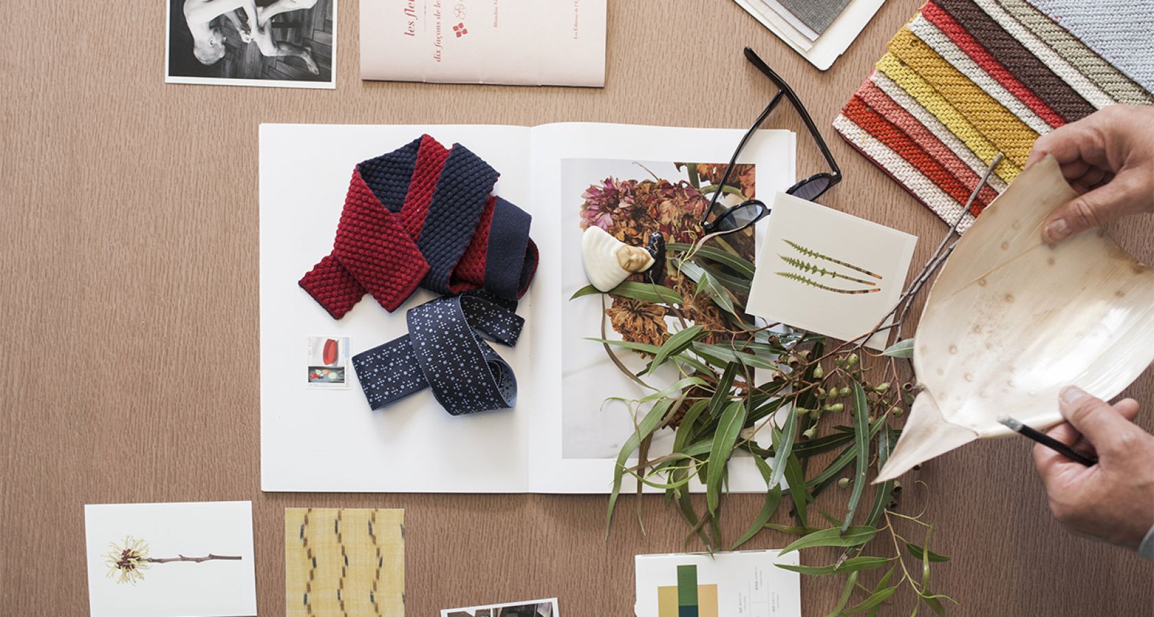
“I am not an academic, nor a pharmacist,” Ridolfo recently commented to design journalist Stephen Todd. “But I am able to understand colour. I’d say my work is somewhere between intuition and anthropology.” Informing the design process for ColourLab saw Ridolfo and Schiavello curate a series of objects and organise these into careful tableaux of, in Ridolfo’s words, “inspirational landscapes”. The team then studied these landscapes closely to tease out threads of contrast and balance from their so-called organised chaos, focusing their attention on texture, light, and intensity. The resulting threads were then grouped into colour families and woven with one another to give the core colours of the palette.
ColourLab, in turn, creates its own “inspirational landscapes”, granting designers not only a series of colour options for Schiavello furniture, but also a set of building blocks with which to construct a space in its entirety. For me, however, ColourLab turns my mind back to that Jacobean courtier contemplating the weight of a nation, its people, its desires. We know now that green is nothing but light buffeting on the spectrum somewhere between 500 and 510 nanometres. And, we know it cannot just be this. We know it is the record of our human condition. Logic far greater than language could ever allow. Poetry far profounder than emotion could ever comprehend.