Building on success
“For Brookfield Place, we wanted to create something that was agile, and was formed off the key learnings from our past offices. We wanted to make this workplace even better than the previous,” says Craig Wiseman, senior project manager at Westpac.
Due to the bank’s size and varying needs, the brief involved a number of requirements. Westpac’s staff work across a variety of different tasks, so it was important that the fitout was carefully deigned for a number of operations, while encouraging employees to be more connected, innovative and nimble. It needed to promote and enable openness, connectivity and wellbeing, with settings where staff could engage with clients and the wider community. Importantly, the bank also wanted to create a workspace that was ‘uniquely Perth’.
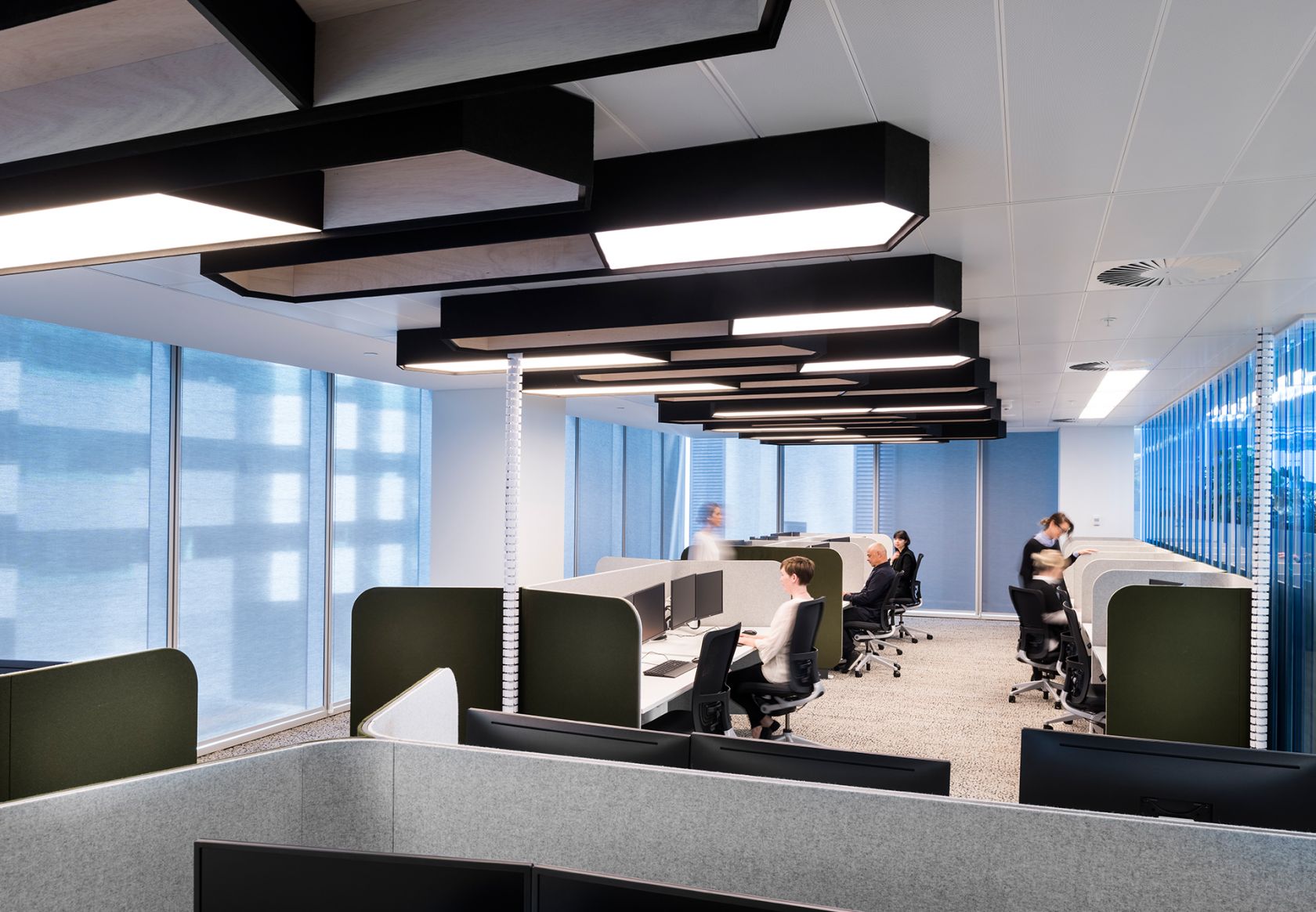
Westpac Brookfield Place is split across three levels in Tower Two of the precinct. Half of level four, which boasts great views towards Kings Park, Elizabeth Quay and the Swan River, is dedicated to client interaction – a crucial element that the previous offices were missing. A greeting and concierge desk introduce a variety of sized meeting rooms, catering up to 116 people. The other half of level four is populated by non-assigned workspaces, broken into neighbourhoods, as are level three and two. In addition, level three also features a large breakout space and kitchen – an area where staff gather for lunch, events and functions.
Creating balance in open plan with
Krossi and Focus
“Brookfield Place has a diversity of work settings across each floor, providing flexibility and choice for staff to be able to work where they can be most effective,” explains Suang Ng, interior designer at Geyer, the studio behind the project’s fitout. “There are places to collaborate, places to exchange ideas and places to concentrate or focus and recharge.”
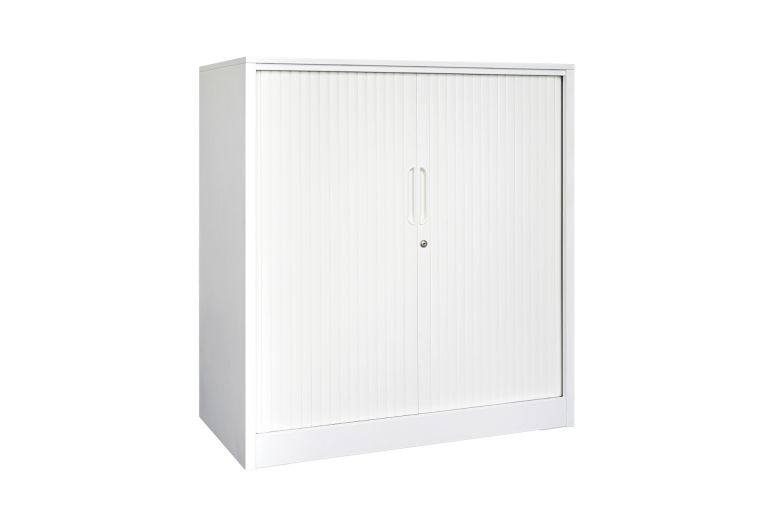
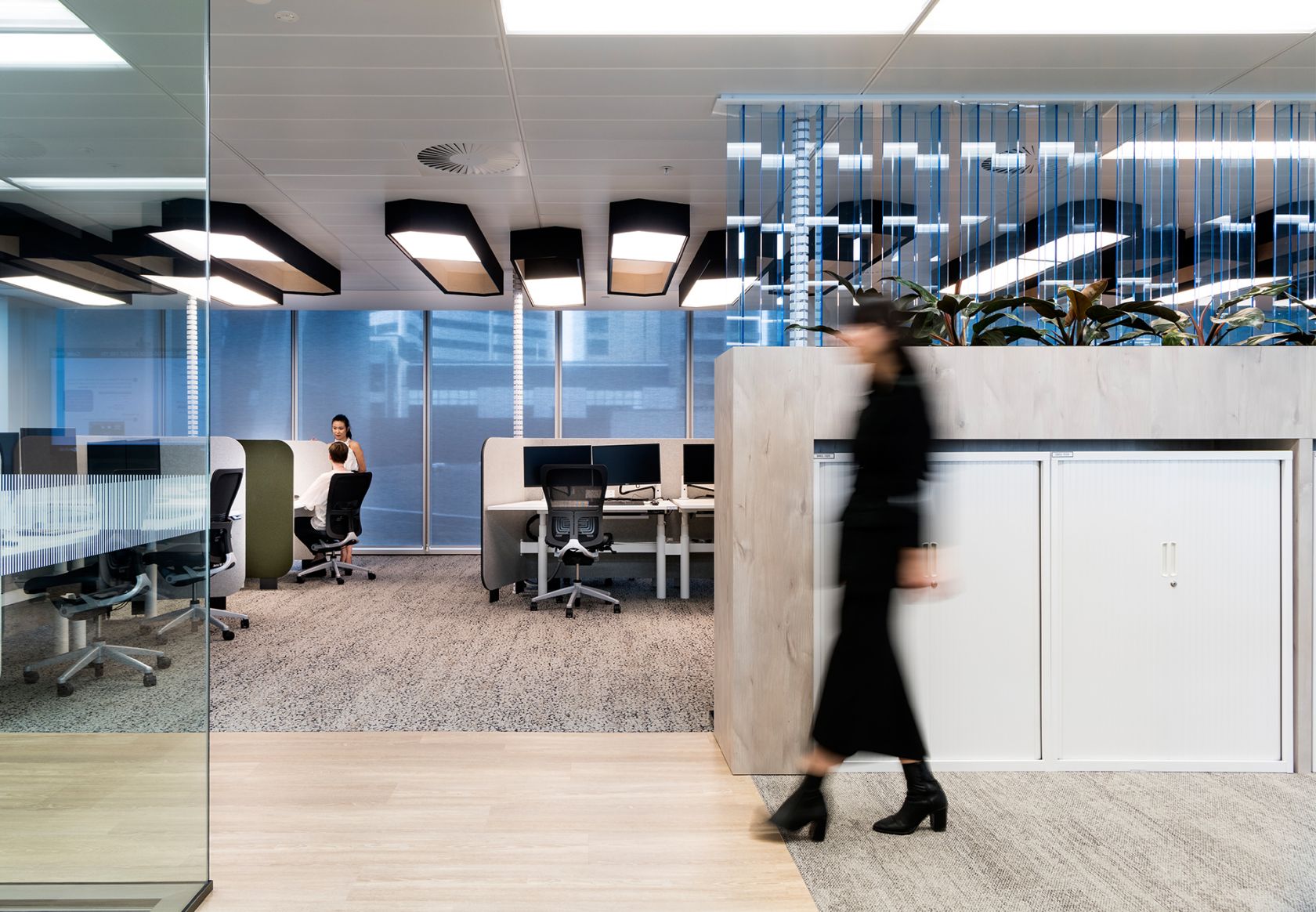
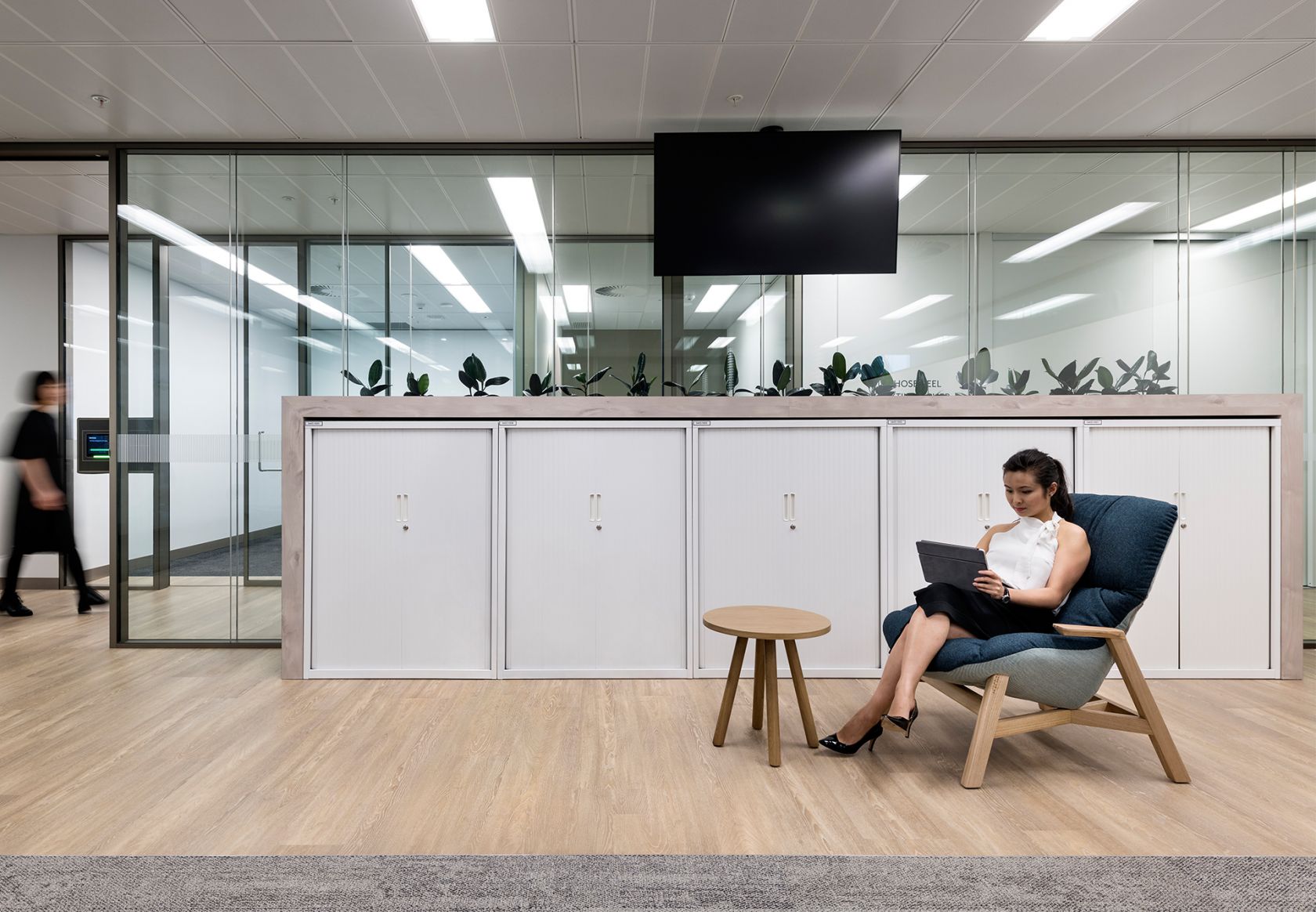
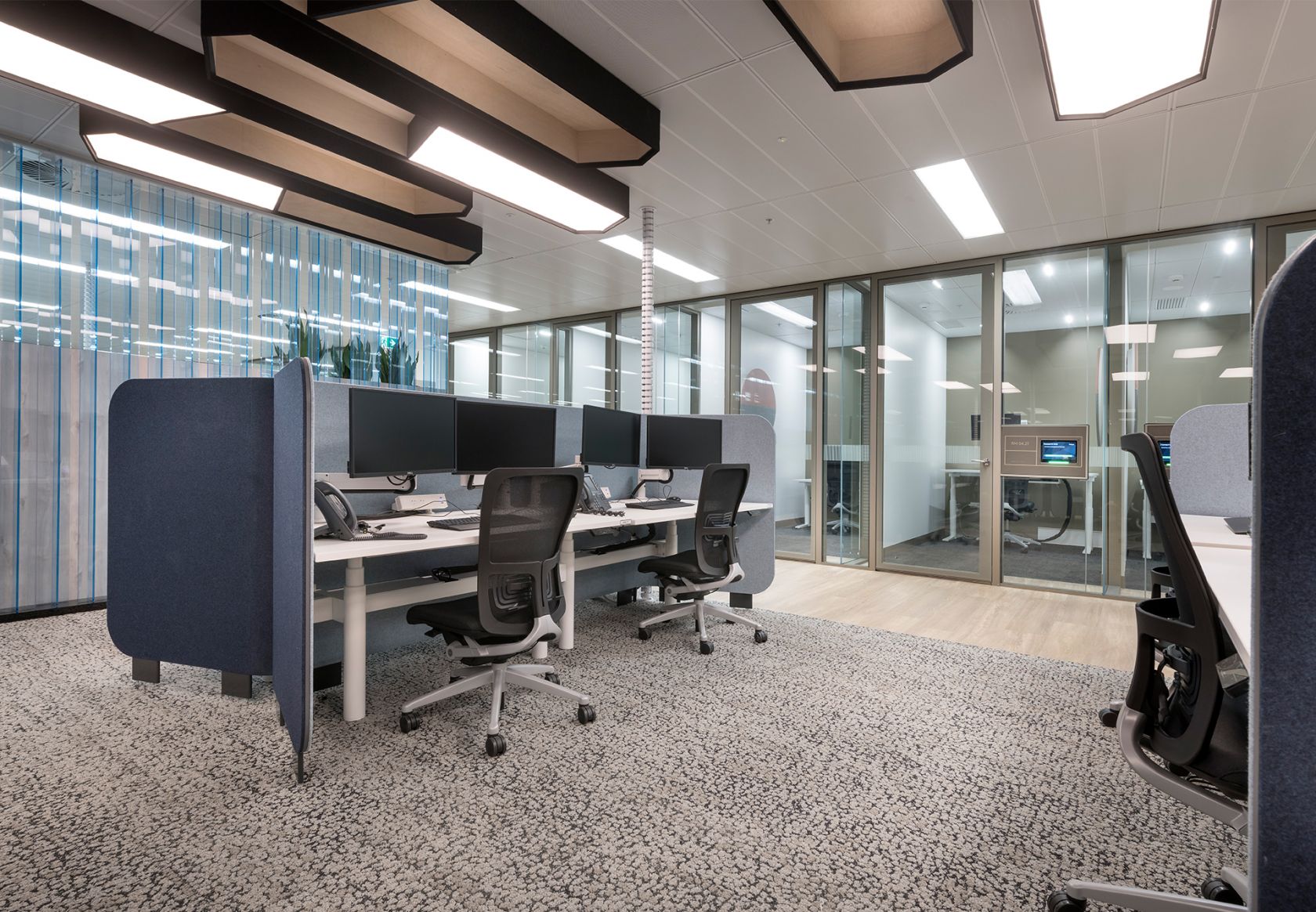
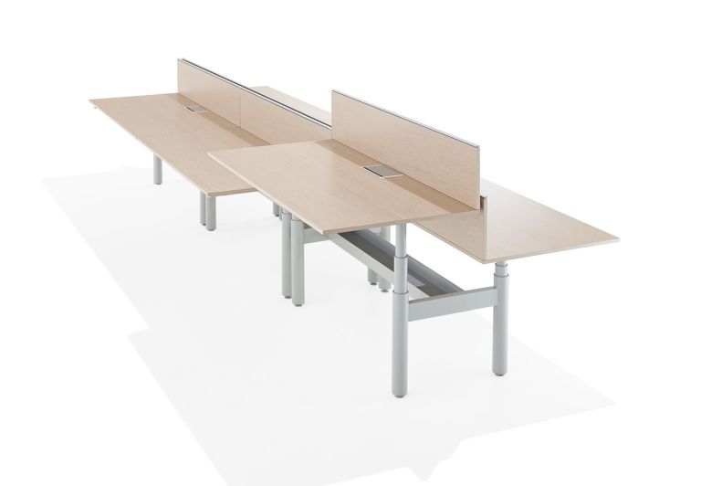
Every desk is a Schiavello Krossi electronic sit/stand workstation. This allows Westpac staff to adjust their work points to suit their own personal needs, while also encouraging movement and wellbeing. Schiavello’s WT Storage units sit at the end of each row of these desks, providing staff with lockable storage and ownership of space. The beauty of WT Storage lies in its understated design which gives way for the spotlight to shine on other fitout elements such as the statement lighting fixtures and blue acrylic screens that populate the space. Customised WT Storage units are also integrated into the joinery, these units with six doors instead of the traditional two – providing more, smaller, lockable storage spaces for things such as papers.
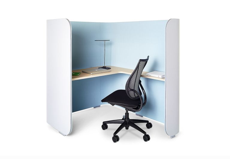
Krossi and its health benefits are harnessed not only in this main open plan space, but also across a number of Westpac’s alternate work points – areas that facilitate more quiet, focused work. Integrated into Schiavello Focus booths, Krossi brings height adjustability to quiet spaces, which are located in clusters
across each floor.
Privacy is an essential ingredient to the formula of engagement, with studies finding that disengagement costs Australia $14.81 billion annually. “What we call the ‘quiet spaces’ include the quiet rooms, Focus pods, and the library, and these make up about 30% of the overall work points,” explains Ng. Similar to the quiet rooms, the Focus booths provide a solo refuge for concentrated work. Allowing for a balance between the noise and visual distractions associated with open plan offices, and the need for a refuge to do focused work, these quiet spaces create balance in the office. Focus booth’s high, curved panels form a visual and acoustic shield between the outside workspace, creating the illusion of being in a separate room, without the expensive requirement of building permanent
rooms within the floorplate.
“Then we have the library,” explains Wiseman. “The library includes loose furniture and another six Krossi workpoints with new, integrated tech. It’s a further space where people can get away from their desks to read or concentrate.”
A workspace that is “uniquely Perth”
“We spent a lot of time talking about how while this is a Westpac office, we wanted people to walk in and know it’s the Westpac Perth office,” explains Wiseman. “Geyer communicated this through the design, the colours, and the materials.” This can be seen across the level two client suites, as well as in areas of level two, where jarrah, a timber that only grows in WA, is used as a feature material. The rich colour palette of the offices also reflects the Perth landscape, including the soft but deep blues of the Schiavello Focus pods. “Whether it’s the sky or the wildflowers, the colours reflect something that is subtle but resonates with the locals,” Wiseman says.
“When people ask what my favourite element of the new fitout is, it’s like asking me to choose a child…,” says Wiseman. “I love the client suites and I love the jarrah ceiling, and I think the library is one of the most beautiful spaces. Everyone has moved in now, and they’re all using the collaboration spaces as well as Focus booths, and the Krossi sit/stand workstations. The feel of the place is fantastic and the people are excited. You can see they have a lot of pride in their workplace.”
As Westpac’s preferred partner, Schiavello was chosen from a competitive tender, following its supply to the previous Barangaroo and 150 Collins Street headquarters projects in recent years. “Geyer and Schiavello have worked together quite a bit, too,” says Ng. “Schiavello consistently has good service, good products, and an after service as well, which is very important to us,
so it makes everything very easy.”
Featured Products
Focus Booth
Krossi Workstation
